The race for the 2016 Presidential Election is well underway. With the end of President Obama’s second term, this is the first race without an incumbent in the visual age of social media. Visual communication is obvious to brands, but what about the presidential candidates?
Here’s a report card on the candidates’ website photography to measure their visual sophistication.
Donald Trump https://www.donaldjtrump.com/
The white balance of Trumps homepage “hero” image is too warm which exaggerates the perception that Trump is an orange, spray tanned candidate.
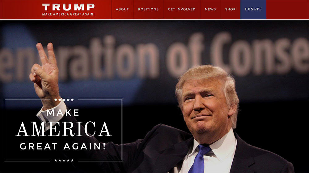
Interior pages have sparse use of photography, but the limited photos show a smiling Trump – a stark contrast to the acerbic-tongued TV persona that has become a hallmark of his campaign.
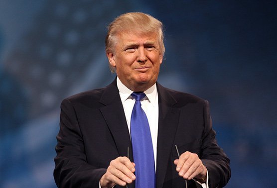
Grade: D
Ben Carson https://www.bencarson.com/
The hero image is highly stylized studio shot with multiple light sources, limited depth of field and post production. The overall design shows a real attention to color and tonality that is lacking from the other candidates.
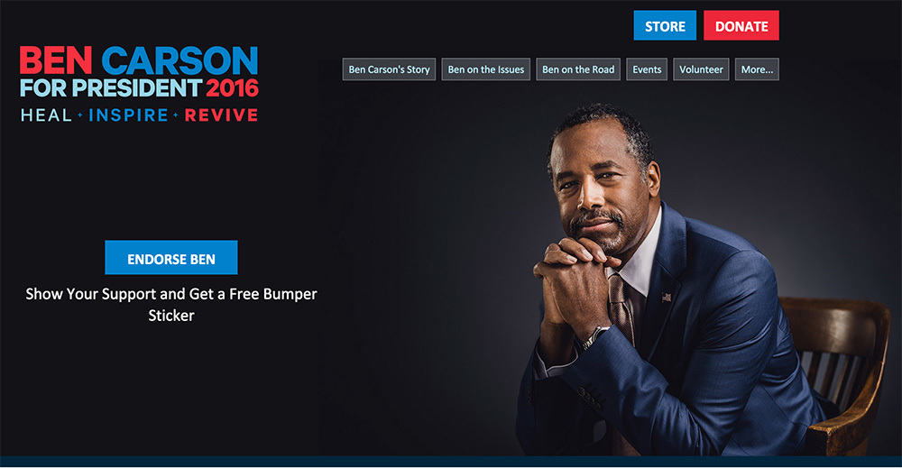
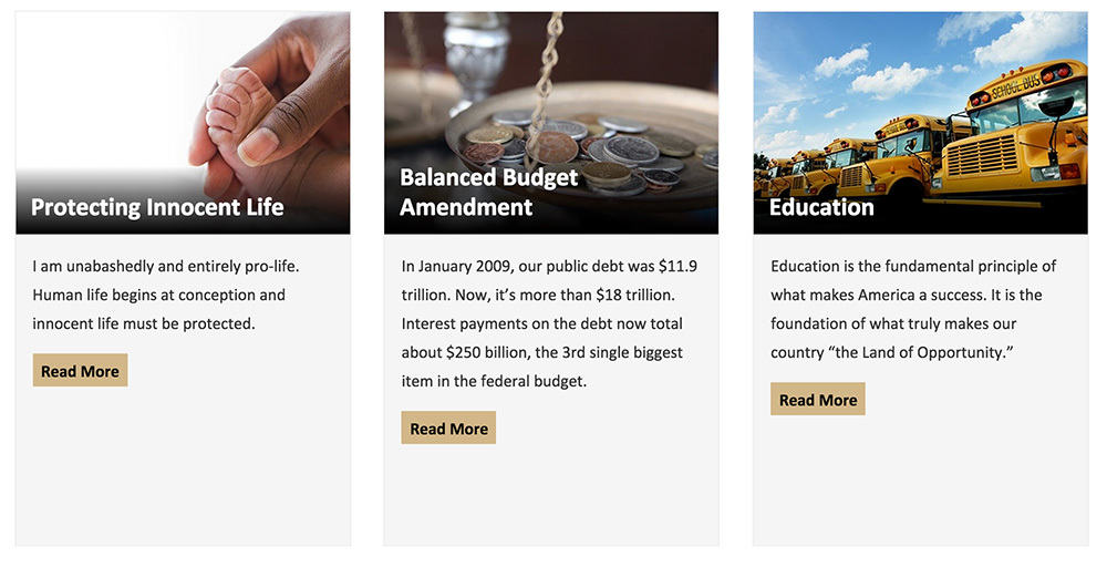
The “Ben on the Issues” page uses a selection of stock photography of varying quality, while the “Ben on the Road” page uses video grabs rather than still photography, which comprises the quality of the visuals.
Grade: D+
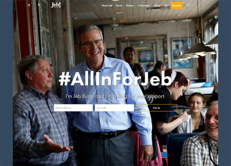
Jeb Bush https://jeb2016.com/
Jeb Bush uses an almost-full viewport design featuring a photo from an apparent campaign stop. The image is editorial in nature and conveys warmth and approachability of the candidate more effectively than Trump or Carson, but the decision not to use the full viewport leads to a strange letter boxing effect that looks sloppy, and undermines what is otherwise a solid photo.

The “Meet Jeb” page features a photo of a selfie that emphasizes the approachability of the candidate. Other interior images are of varying quality. Curiously the hero images on other pages have obvious overexposure problems that seem at odds with some of the other high quality photo selections.
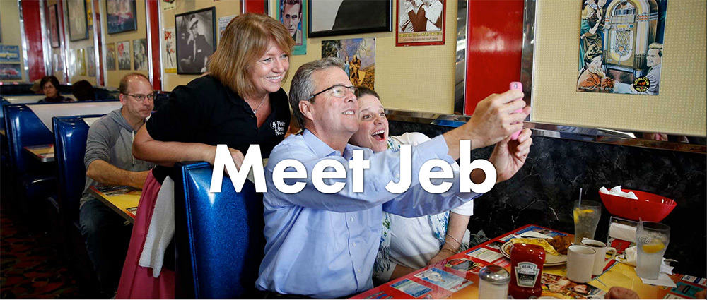
Grade: C
Ted Cruz https://www.tedcruz.org
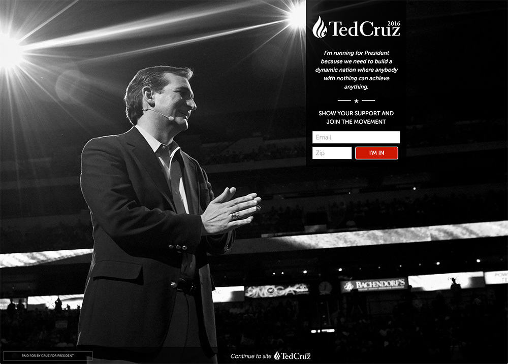
When you click an paid ad for Ted Cruz, you’re directed to a landing page that uses a full viewport, black and white image. The starburst patterns from the stage lights partially mimic his campaign logo, and the overall effect is reminiscent of an television evangelist (complete with head mic), which might be the desired intent.
The hero image upon entering Cruz’s website proper is a lit, outdoor portrait with a softbox. It is a very nice photo.
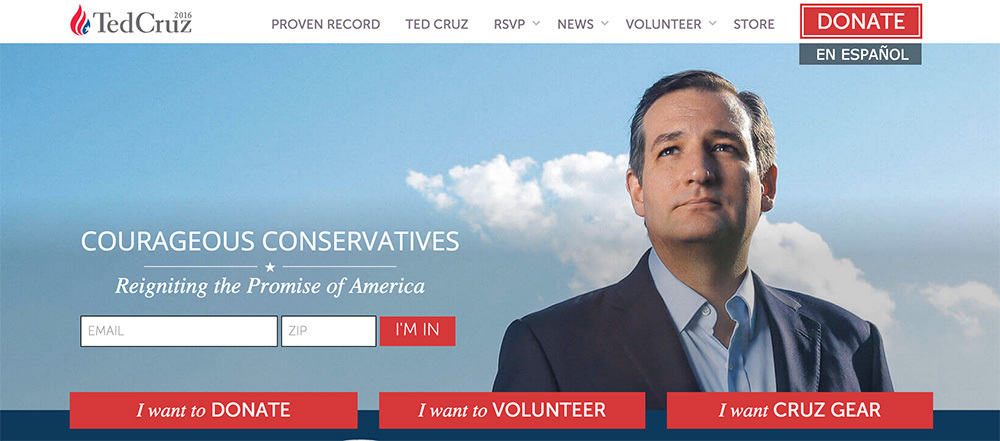
Interior photography is generally of a higher quality than the other candidates, with a number of posed portraits. But like the other candidates, overall use of photography is low.
Grade: C-
Mike Huckabee http://mikehuckabee.com/
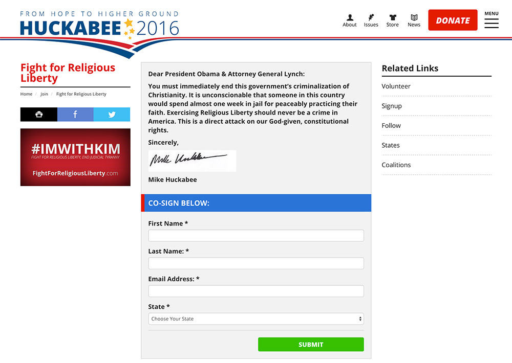
Currently, the homepage redirects to a petition, which features no photography. Huckabee’s signature on the page is contained within a white rectangular block, which contrasts heavily with the gray background. Apparently, no one in the campaign knows about alpha channels and PNGs.
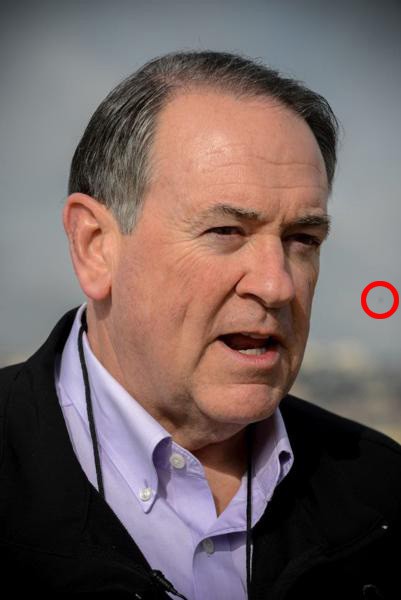
Interior photography is sparse and small. On the “About” page, a heavily vignetted photo of Huckabee has what looks to be sensor dust to the right of his face.
Grade: F
Hillary Clinton https://www.hillaryclinton.com/
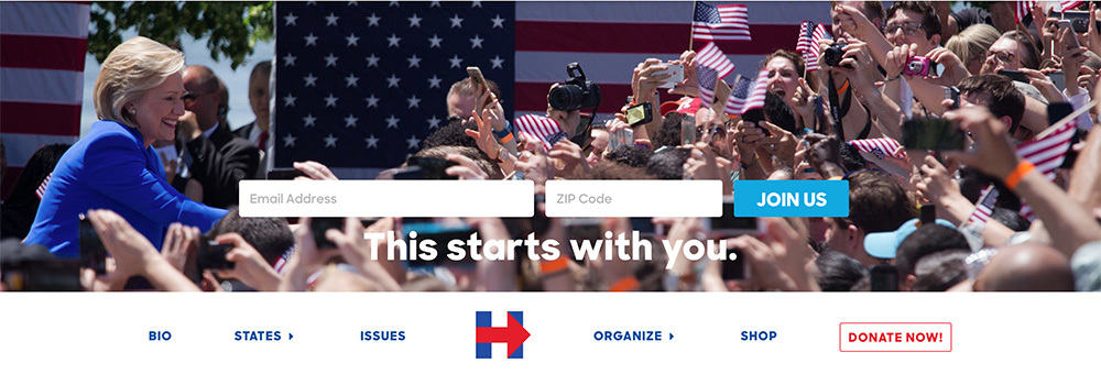
The homepage image is a narrowly cropped image of Hillary Clinton at a rally. Faces in the crowd are, for the most apart, indistinct but filled with American flags – a bit cliché – and the high noon sun position casts a heavy shadow on Clinton’s face.
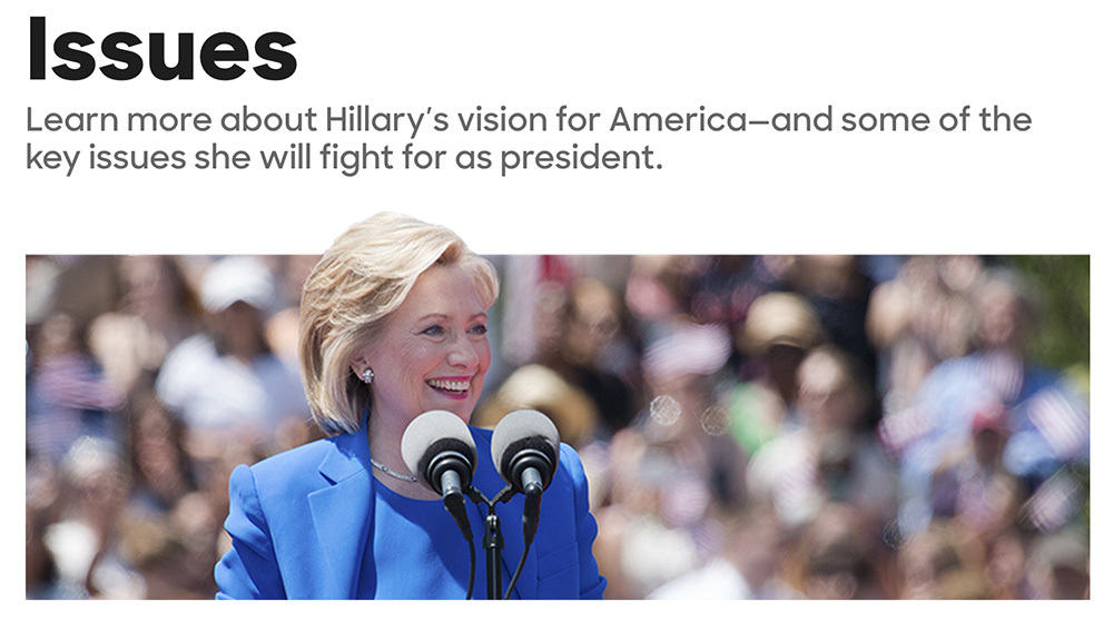
Interior photography on the secondary pages is small, and her “Issues” page features a strangely masked photo of Clinton’s head. Was the campaign cropping out a distracting element in the background? Were they trying to make the candidate “pop” off the page?
The tertiary issues pages have the same narrow crop on the hero images. Although the crops work for some images, it’s entirely distracting for others.
Grade: D+
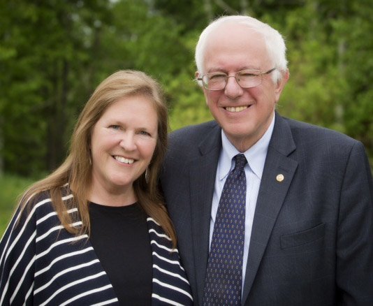
Bernie Sanders https://berniesanders.com/
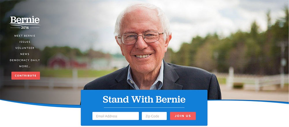
The homepage image features a smiling and approachable Sanders. The vignetting helps offset the reverse type of the navigational menu. However, the photo is very grainy and the white balance is overly warm.
The “Meet Bernie” page features a heavily softened image of the candidate and his wife. It’s such a drastic contrast to the other photos leading to an almost comic effect. Sanders is 74 years old, so there’s little point in trying to mask his age with poor Photoshop technique.
Like Clinton, Sanders uses narrowly cropped images at the top of each issues page. Although this saves vertical space, one can’t help wonder whether a more judicious use of photography would help enhance visual communications.
Grade: D
***
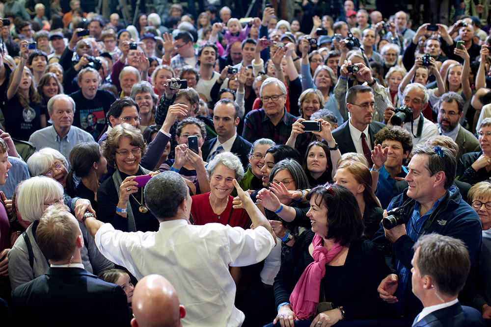
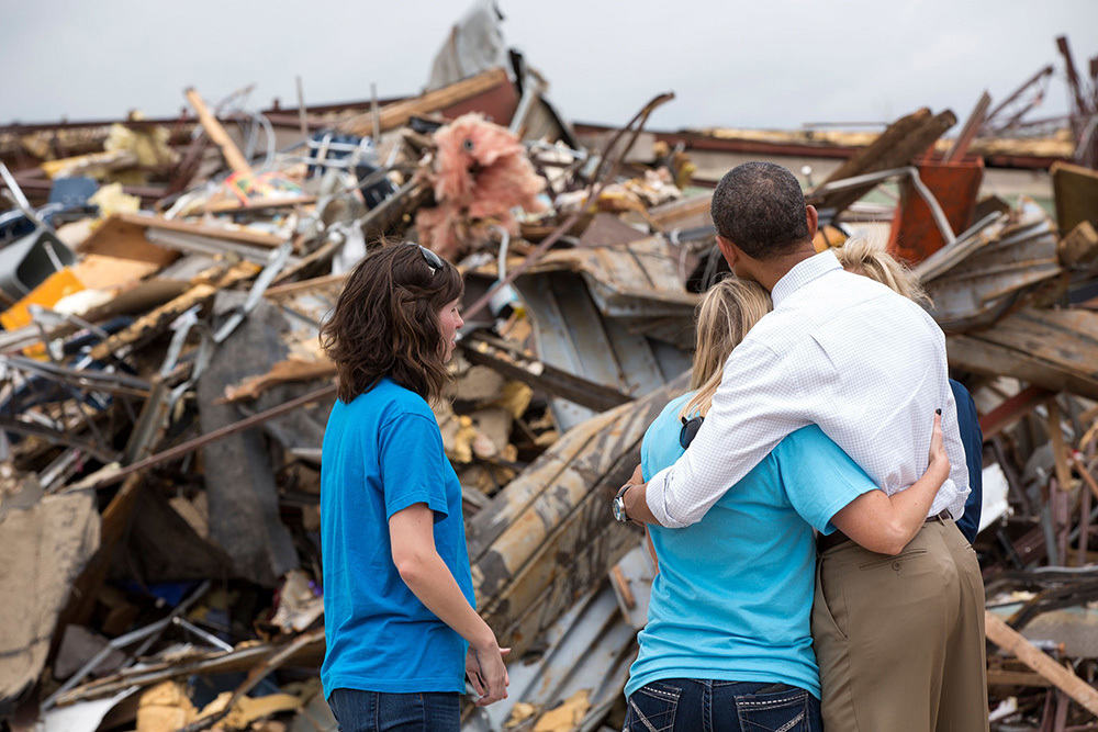
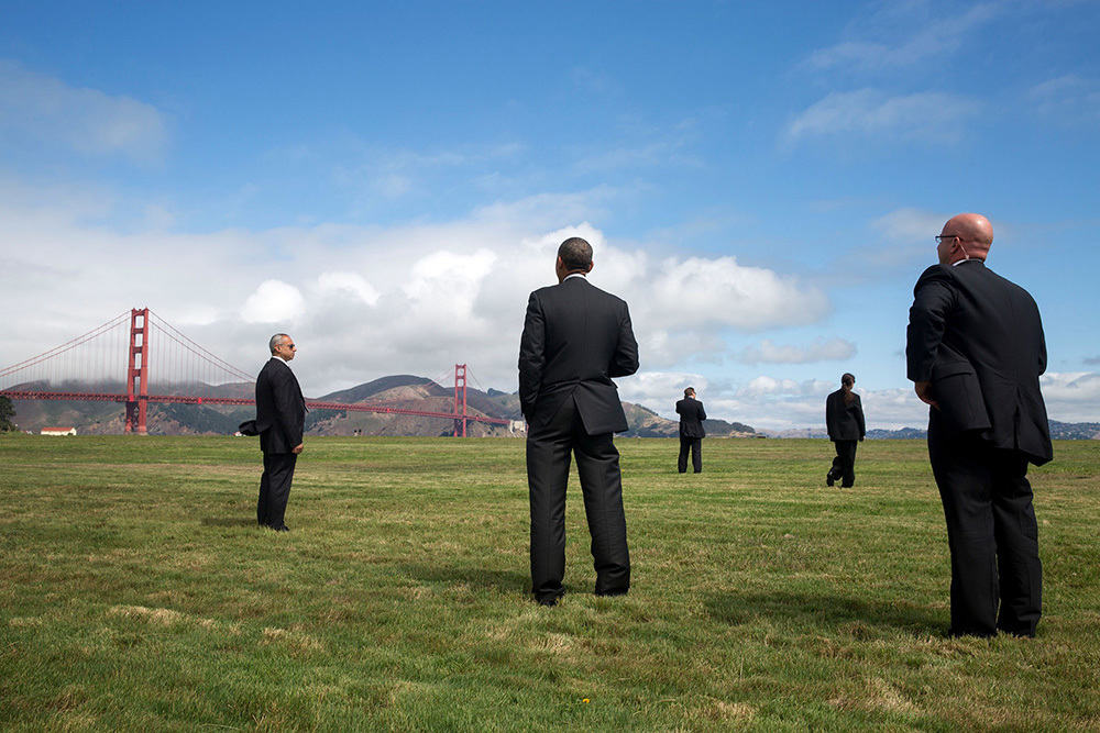
Overall, the state of photography in presidential politics is poor, showing very little visual sophistication. Contrast this to the types of images coming from White House photographer Pete Souza, which are highly effective pieces of Presidential marketing and propaganda. Whether you agree with Obama’s politics or not, he indisputably has the best photography at his disposal.
Further, there is a real lack of imagination in the use of images. The variety of current slide show presentation and technology is vast and proven, yet the candidates have stuck to a print-style layout that won’t be effective with digital natives and younger voters. Imagine the effect of a slideshow of people waiting to see Bernie Sanders similar to The New York Times’ The Wait.
Looking at the candidates’ websites reinforces my assertion that every campaign should hire a full-time photographer and photo editor to ensure that their photography is of high quality, and more importantly, that a visual brand and communication guidelines exist in the first place.